Friday, 29 November 2013

Brief 2 : Nada Mock Ups

Hexagon mock up

Using the nets that we built within Illustrator we applied our branding to these nets, the bottom net for the inner tube was simple as this simply had the whole pattern applied to it, however we felt it appropriate to change the dimensions of the original patterns which were initially built around a square so maintain visually constancy, that for the packaging it would not be more successful to make the pattern fit the dimensions of the packaging in that the pattern fit with each face of the hexagonal packaging. 

We applied the branding and technical information to the outer tube, we printed and mocked up this as we felt it necessary that all text was readable and that the grey's we had chosen we're light enough when printed. After creating this mock up we made some slight changes in lightening the grey to 20% the opacity and black and we also reduced the font size as we felt it could be smaller, to a point size of 7. The layout worked well and remained the same as a result of this mock up.


Triangular mock up


With the other net for the second range of packaging that is triangular in shape we had to test and mock up a range of different layout as our branding didn't apply exactly to this format as it did with the hexagonal format packaging. It was important to print out and mock this up to see what was working and what wasn't.


With the other net for the second range of packaging that is triangular in shape we had to test and mock up a range of different layout as our branding didn't apply exactly to this format as it did with the hexagonal format packaging. It was important to print out and mock this up to see what was working and what wasn't.


The final layout and composition that we chose for this packaging format after the various experiments. We felt that this variant worked the best as it more closely resembled the layout of the other packaging format, which will maintain a consistent look and feel across the range.


Thursday, 28 November 2013

Brief 2 : Nada : Developing the nets

As myself and Tom discovered using the hexagonal format for the loose pasta that aren't noodle shaped wasn't very effective as it didn't give us enough volume to hold enough pasta. We therefore started to explore other format to hold this pasta to build the packaging range.


We then looked at out original hexagonal packaging and considered how we could use that as basis but somehow create more volume. We therefore simplified this net from a hexagon to a triangle which dramatically increased the volume which would mean it would also more pasta but it was also maintained the angle edges that visually appeal to use and are effect within the hexagonal packaging.

Brief 2 : Nada : Brand Guidelines

Brand Guidelines

Now that we had built our adaptive typeface that formed the Nada brand and built a range of pattern we put together a set of brand guidelines that detail how to use the brand but as a process this will be informing how we apply the brand to the packaging nets. 

We both agreed that we wanted to do some unusual with our brand guidelines rather than create a pdf booklet which is a common format for brand guidelines. We decided to create them as a banner print, which one long print with all our brand guidelines on. Our reasoning was that if it were to be an actual product and in production it could be something that designers put on the wall as a constant reference when designing for the brand rather than looking for a multi page pdf document. We are extremely happy with the result we think it both represents our brand but the format also works well, once we got it up in the studio we constantly found ourselves referring to it as a reference point when we were designing for Nada.

Below are sections of the banner we designed.


Branding

The Nada brand is an adaptive and flexible identity which is built upon a bespoke typeface which instills and encompasses our brand aesthetic and brand manifesto. The typography consists of 8 individual typefaces which when used dynamically build an adaptive brand identity. The logo mark has a static variant, this acts as the primary logo mark. However the brand is built upon the logo changing across products ranges and product types.


Pattern


The Nada brand also consists of distinct patterns which have been developed to reflect both differing pasta forms and flavours within the Nada product range. The patterns use both the colour palette and the typefaces as inspiration, abstractly reflecting pasta shapes and forms as well as flavours. In the essence they are geometric, simplistic, continous and inherently bold, colourful and playful.


Wednesday, 20 November 2013

Brief 2 : Packaging

Packaging  Key Influences

Collaboratively we looked into a whole range of different packaging which we documented in our research book, however below are the key influences from which I believe made the most impact on our research and art direction.

Example 1

Below is a very clean / modernist example of pasta packaging. It is beautifully slick with a simple yet effective layout for the ingredients, barcode and instructions. The front is also beautifully crafted as you can see the pasta poking through a dye cut which allows the consumer to view the product. The colour pallet is also quite tasteful and differently gives off a more luxury feel apposed to a cheap bag of home brand pasta.


Example 2 : Everything looks the same!

Opposed to the luxury packaging above we kept coming across similar ideas. These reacquiring ideas included dye cuts of pasta shapes in long rectangular or cylinder boxes with pasta poking through. This was one direction we both thought had been over done and not the sort of direction we wanted to take.


Example 3

Moving away from the pasta packaging we were quite influenced by other high end food packaging. Below is Yauatcha, a high end Chinese tea house and dim sum restaurant. The packaging is done by Made Thought, who developed a bespoke packaging approach for a diverse array of products ranging from exquisite patisserie and rare teas, through to ceramic tea sets and scented candles. They produced a delicate patterns which became a uniting aspect of this solution and also served to underline the oriental nature of the brand. 

We both loved the contrast between the slick typographical lid and the patterns underneath. This packaging could easily come across as some sort of beauty / make up product. 


Example 4

Bermellón is a Mexican confectionery shop that specialises in the premiumisation of traditional spicy treats typically sold on street markets. The shop’s identity and packaging, designed by Anagrama, fuses a bold and intense fluorescent colour palette with the fine detail and craft qualities of an adhesive label. We again both loved this food packaging because like the example above it could easily be conceived a make up range of some sort. The net of the box is extremely simple however how the label sits around the corner is very modern and contemporary and looks nothing like what you see on the everyday supermarket shelf.


Example 5

Our final key influence was the set of packaging below made by Happy F&B, the project was to produce s set of christmas gift boxes, inspired by statistics and infographics. Each gift boxes comes with patterned tissue paper and stickers. We loved the hexagon boxes, as they are quite unusual and would go with the geometric theme of our type specimen and pasta patterns.


Mocking up our packaging

Today was the first day of production where Tom crafted the nets for our pasta and noodle packaging. We went along with the hexagon nets in the end with a telescopic lid. Below are some photographs I took of our progress so far. The next step is to invest in the correct paper stock as we want our boxes to be quite sturdy and correctly crafted to achieve a portfolio piece.


After conducting some further research we decided that for the tall pasta, like the noodle we would construct a telescopic tall tube to hold the product. I built a net on illustrator which we could use to mock up the idea from card to work out the exact sizes we needed to make the packaging.


We printed the net on standard stock to mock up to confirm dimension as well as ensure the net worked as a telescopic tube. As a result of this I found that the net only needed to 1mm smaller for the inner tube rather than 2mm smaller which I have originally made it. In order to make it tight fit it needed only to be 1mm smaller, I also tweaked the dimension of height to better fit the size of the pasta as a result of this mock up.


Size and range

We also experimented with created different size variants of this packaging as we needed a slightly different format for the loose pasta shapes like the Fusilli, however the hexagonal format still didn't give us enough volume to hold the space as it's much more bulky than the noodles. Myself and Eve will need to considered for packaging shapes and formats for this alternate packaging.


Stock & Materials

Today we went down to the print room to enquire about the thickest paper stock available which is easy to fold. Sadly a lot of the stock which we found was too thin plus due to being made up of multiple layers of paper, it easily cracked when folded. 

The plan now is to order some grey board offline (see below) and mount a design on to it. James also has a brilliant laminating machine which make the paper robust and gives off a satin effect. We have researched into lots of variations of packaging and are made out of a gloss or a satin stock. The product we aim to make is also influenced by makeup packaging so we want it to look and feel like a luxury product.

Below is an example of a piece of paper that has been laminated (you can see the shine) Plus due to lamination it is really easy to fold without cracking the paper.


Brief 2 : Nada Packaging Patterns

Influential colour palettes 

Tom and myself collected a broad range of visual research which heavily influenced the visual style of our packaging. We intend to apply a set of brightly coloured patterns to our range of products. Instead of just looking into patterns we sourced visual research that used applied graphics and pattern design in areas of set design and advertising. 

Adi Goodrich (work shown below) displays a rich and visual style that contrasts contemporary and post modernist influences in colour, pattern and art direction. She also displays experimentation with food photography which decoractively fuses the foot ware products and the advertising set up together. The colour pallets are also very interesting as she plays around with gradients, pastel colours and examples of clashing pallets which give off a playful and vibrant visual style. 


Colour palette 

We took influence from the work above and set out to create our own swatch of colours to work from. We intend to stick to the five colours below which will be highlighted in our brand guidelines. We chose these colours because they will appeal to our target audience (which is female 20 -35) plus as a pallet they work very well together. 


Patterns

Using the colour swatches above Tom and myself set out to create three patterns each in order to produce a range of versatile and geometrical patterns. The patterns all had to work together along with the main concept of flavour and pasta / noodle shapes. 


Noodles : Pumpkin and Ginger

This is a pattern I designed based on the concept of fusing the flavours pumpkin and ginger together. I illustrated this using a geometric pattern made up of triangles. The colour pallet also references the colour of a pumpkin contrasting a pastel pink. Within the various pattern our approach focus on either of two principles, the first principle being to represent the pasta shapes or forms, or like this pattern to visually represent flavour. This pattern uses small triangles in different orientations to reflect to mixing of these two flavours, the triangle itself is also representative of the strong and sharp flavour of ginger.


Pasta : Manfedine

This is a pattern Tom drew based on Manfedine pasta which is a long ribboned pasta with constant curves like the pattern below. Again orange is used to contrast a pastel violet. This pattern is a direct representation of the pasta form itself with is a long piece of pasta with curved rounded edge running down each side. 


Pasta : Fusilli

Tom went on to create this very successful pattern that represents the pasta shape Fusilli, a pasta shape that is structured like a long corkscrew. The colours work beautifully with the geometric pattern and constrasts the looser patterns like the Manfedine example above. Furthermore in a more abstract way this pattern reflects the angle of lines within Fusilli pasta to create a repeating pattern.


Pasta : Farfalle

This is a pattern I created based on Farfalle pasta shapes. In a more loose way this pattern also looks to reference the form of Farfalle but in a more simplified and abstract manner.


Pasta : Conchiglie 

Within this pattern we used both principle and represented the flavour and form. This is often a pasta that you mixed with sauces and ingredient and we feel this pattern reflects that.


Noodles : Sweet Potato & Buckwheat


Again this pattern is representing the flavours of the pasta, the buckwheat reflected by the small circles mixing with the large pieces of sweet potato. This pattern may need further development, it feel it looks like bacon and carrot.


Gold foiling / vinyl 

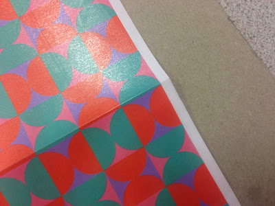
The packaging myself and Tom designing for the Nada brand will be high end as will the brand itself therefore we started to explore print possibilities within the patterned element of the brand. We have found during our research that healthy foods are often packaged in a dull and muted manner and really use print finishing techniques and we wanted to change that. We started to look at using gold foiling within the pattern. To explore this we printed our patterns at A3 sizes to both text how the patterns worked printed, as on screen isn't always an accurate representation as well to then experiment with potentially using a gold within the pattern.


After experimenting with this approach we both agreed that this was the successful direction to take with the packaging, we then went back to digital patterns to applying this new thinking to the pattern and ensure this idea would across all of the patterns.


Applying the gold to the patterns

Furthermore after evaluating all of the patterns once we have printed them we felt that one of the pattern simply wasn't working and this was for a number of reasons, it didn't fit within the series that the other patterns created, we felt like it looked like many thing but didn't look like the approach we were trying to achieve therefore we went back to the drawing board with this pattern and developed something new that fit better within the series of patterns.


Developing the patterns


Pattern Casts Off's

We explored and developed a selection of pattern before we chose the above pattern as our final set. Of the many reasons behind not choosing these pattern were mainly that they were either over complicated, or didn't best reflect pasta shapes and forms, or flavours of pasta.