Packaging Key Influences
Collaboratively we looked into a whole range of different packaging which we documented in our research book, however below are the key influences from which I believe made the most impact on our research and art direction.
Example 1
Below is a very clean / modernist example of pasta packaging. It is beautifully slick with a simple yet effective layout for the ingredients, barcode and instructions. The front is also beautifully crafted as you can see the pasta poking through a dye cut which allows the consumer to view the product. The colour pallet is also quite tasteful and differently gives off a more luxury feel apposed to a cheap bag of home brand pasta.
Example 2 : Everything looks the same!
Opposed to the luxury packaging above we kept coming across similar ideas. These reacquiring ideas included dye cuts of pasta shapes in long rectangular or cylinder boxes with pasta poking through. This was one direction we both thought had been over done and not the sort of direction we wanted to take.
Example 3
Moving away from the pasta packaging we were quite influenced by other high end food packaging. Below is Yauatcha, a high end Chinese tea house and dim sum restaurant. The packaging is done by Made Thought, who developed a bespoke packaging approach for a diverse array of products ranging from exquisite patisserie and rare teas, through to ceramic tea sets and scented candles. They produced a delicate patterns which became a uniting aspect of this solution and also served to underline the oriental nature of the brand.
We both loved the contrast between the slick typographical lid and the patterns underneath. This packaging could easily come across as some sort of beauty / make up product.
Example 4
Bermellón is a Mexican confectionery shop that specialises in the premiumisation of traditional spicy treats typically sold on street markets. The shop’s identity and packaging, designed by Anagrama, fuses a bold and intense fluorescent colour palette with the fine detail and craft qualities of an adhesive label. We again both loved this food packaging because like the example above it could easily be conceived a make up range of some sort. The net of the box is extremely simple however how the label sits around the corner is very modern and contemporary and looks nothing like what you see on the everyday supermarket shelf.
Example 5
Our final key influence was the set of packaging below made by Happy F&B, the project was to produce s set of christmas gift boxes, inspired by statistics and infographics. Each gift boxes comes with patterned tissue paper and stickers. We loved the hexagon boxes, as they are quite unusual and would go with the geometric theme of our type specimen and pasta patterns.
Mocking up our packaging
Today was the first day of production where Tom crafted the nets for our pasta and noodle packaging. We went along with the hexagon nets in the end with a telescopic lid. Below are some photographs I took of our progress so far. The next step is to invest in the correct paper stock as we want our boxes to be quite sturdy and correctly crafted to achieve a portfolio piece.
Size and range
Stock & Materials
Today we went down to the print room to enquire about the thickest paper stock available which is easy to fold. Sadly a lot of the stock which we found was too thin plus due to being made up of multiple layers of paper, it easily cracked when folded.
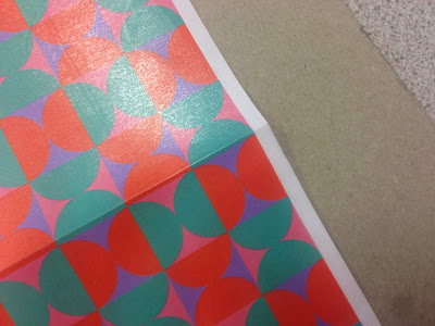
The plan now is to order some grey board offline (see below) and mount a design on to it. James also has a brilliant laminating machine which make the paper robust and gives off a satin effect. We have researched into lots of variations of packaging and are made out of a gloss or a satin stock. The product we aim to make is also influenced by makeup packaging so we want it to look and feel like a luxury product.
Below is an example of a piece of paper that has been laminated (you can see the shine) Plus due to lamination it is really easy to fold without cracking the paper.


0 comments:
Post a Comment